The “Tsukudani Day” poster posted on June 29 by the Ministry of Agriculture, Forestry and Fisheries’ official X account became a talking point for being “tacky” in the best sense. In response to an ITmedia NEWS interview, a representative of the Public Relations Office explained that the design was the result of trial and error in finding a way to convey the message clearly. The representative discussed the aims of the design and the system for posting on social media.
The poster is a single sheet with garish colors, as though it had been created with PC graphics software from the 2000s. The headline “Tsukudani Day” is outlined with a rainbow gradient, while the words “Originating in Tokyo” are encircled by orange radial lines. A speech bubble in a Kansai dialect beside a plate reads, “There are more than 100 kinds of tsukudani, y’know!!!!” At the bottom are an illustration of three people with bulging eyes and a purple emoticon. Flashy decorations with an unmistakable sense of déjà vu and illustrations resembling free clip art are all condensed into a single poster.
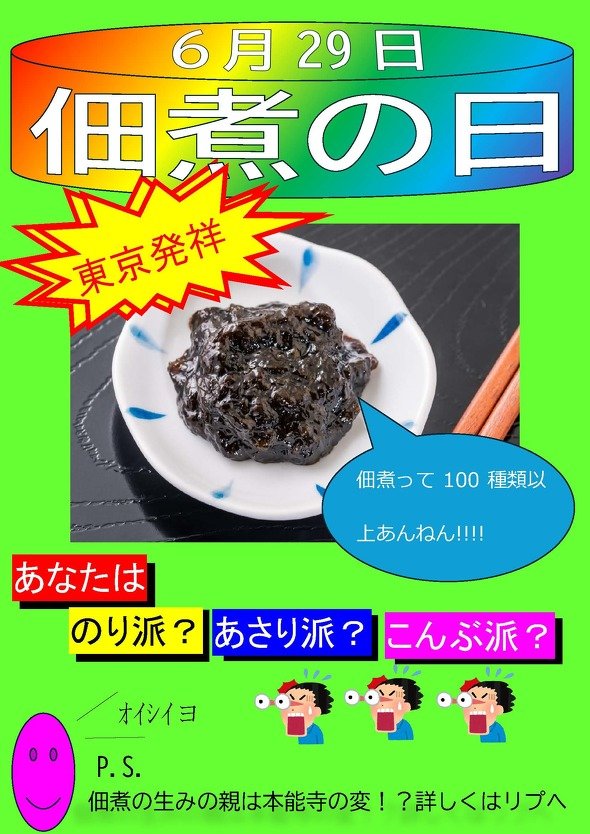 The talked-about “Tsukudani Day” poster (Ministry of Agriculture, Forestry and Fisheries)
In response to the post, X’s comment section filled with remarks such as “Tacky in the best way” and “I love the warmth that AI can’t produce.” There were also replies citing a post that described the poster as having “that made-with-Word-2003 look” and a video showing how to make slides deliberately tacky, calling it “the source of that déjà vu feeling.”
The aim of the “tacky” design
Regarding the aim of the poster, the Public Relations Office representative said, “We’d be pleased if people learned about tsukudani and consumption increased,” adding, “Nothing can begin until people see it first,” and explained that they had devised an attention-grabbing design.
That was how they arrived at this design. The representative explained, “As we convey various types of information, we experiment with different formats to find what resonates and what is easy to understand,” and said they had reached the conclusion, “Perhaps this current format is good.” The team refined its social media communications and adopted this design. However, they did not give a clear reason for going all-in on a design with such a deliberately dated look.
In the comment section, there were also many voices praising the fact that generative AI had deliberately not been used, such as “Never would I expect to encounter an image like this in an age when AI is widespread” and “It’s really great that it doesn’t use AI.” When asked whether there had actually been an AI-conscious aim behind the design, the representative made it clear that they had not intended to compete with generative AI.
The ministry had also published a post using generative AI a few days earlier and explained, “It’s not that we don’t use it.” As for aiming to differentiate itself through a handmade feel, they said, “Honestly, we hadn’t thought that far.” It was only after reading the comments that they realized, “I suppose it does have that aspect, too.”
On X, there were also voices praising the ministry for its skillful use of social media. Regarding these operations, the representative explained, “As the Public Relations Office, we mainly operate social media, including X.” They added, “We regularly meet as an editorial meeting to brainstorm what kinds of posts would be good, and so on,” and said the poster was one of the ideas that came out of a meeting.